Color exercise & physical 3d outcome exercise.
In class, we were asked to experiment with different colors and media based on one of our outcomes, in this post I will explain how it went and what I improved based on this task.
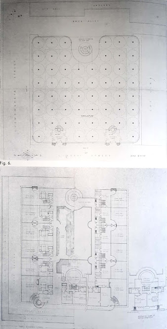
This was the base structure that I printed for this task. I used a 1:400 scale and 0.3 = 0.5 pens, this was supposed to be an elevation which is why it has no perspective.
In class, I first started by coloring using different color patterns, and I tried this one in which the main focus was on the glass fronts, and how they would look. I also wanted to see what the stone tiling would look like around the arches which I don't think was successful at all.
I also tried this combination but then again I think it just looks unpleasant.
here I got the idea to make it more monocolored, with black columns and arch contours which I think are just classical and typical that is why I decided to broaden it and started working on this on my digital 3d model.
I decided it was best to use white marble as a dominant color for this structure's decor, I believe that the black columns and blue arches in my design mix modern simplicity with classical beauty. I can create vivid shadows that draw attention to architectural details by utilizing different shades of black to offer depth through textures or granite. In order to improve the design's visual appeal, I want to experiment with materials like white and blue marble. This color scheme, in my opinion, will enhance the building's coherence, flow, and openness. It also improves the contextual aspect of my design since the blue marble will symbolize the spirit of swimming as a sport because it is a recreation facility.
Overall I think this task was successful in reflection but not in class, the media that I used in the drawings I think was inadequate. However, it gave me an idea of the colors that I should implement in my design, I will discuss the materials and the sourcing of marble in the next posts.


Okay, better.
ReplyDelete