The Johnson Wax Buildings; Frank Lloyd Wright
As Gibson (2021) stated, the Johnson Wax Headquarters – also known as the Johnson Wax Administration Building – was completed between 1936 and 1939 in Racine, Wisconsin. It provided the main office for SC Johnson & Son, an American manufacturer of household cleaning supplies.
Despite its location in an industrial park, Wright designed the building in his organic architecture style with references to natural forms. This is exemplified in the main open-plan office space, which is often described as forest-like. This is exactly what I am looking for whilst designing my space, it needs to have a natural aspect to it in order to accommodate it to its environment.
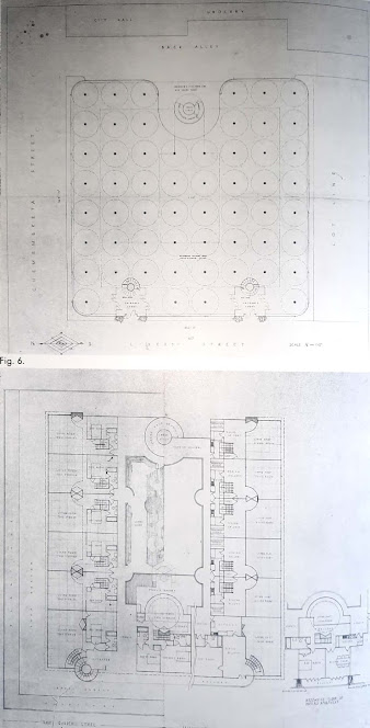
Fig. 7. Roof garden level and mezzanine floor plan. Capital Journal project. Sepia print. 33" x 34". (Courtesy of the Frank Lloyd Wright Foundation)
Fig.9. Section, looking south. Capital Journal project.
This is characterized by a large mezzanine-enclosed, skylight office space for the company's-clerical workers, the Johnson Administration Building resembles the Larkin Building conceptually. the mushroom-column-and-slab structural system and the two-story space are based on the Capital Journal project. (Drawing by Gerald Wilson)
- Gibson, E. and Gibson, E. (2021) Frank Lloyd Wright designed the Johnson Wax offices as a forest open to the sky. [Online] Dezeen. Available from: https://www.dezeen.com/2017/06/14/frank-lloyd-wright-johnson-wax-administration-building-headquarters-racine-wisconsin-open-plan-office/.
- Lipman, J. (1986) Frank Lloyd Wright and the Johnson Wax Buildings. New York. RIZZOLI INTERNATIONAL PUBLICATIONS, INC.


Mouad, I'm not sure how you think this is a research post. Surely you understand that to cut and paste from another source and to not have any evidence of sources in terms of referencing is not adequate. I want you to use this research as part of your justification of your design idea. how is Wright's design relevant to your project? You need to make this clear.
ReplyDeleteFlesh this out and add your sketches
ReplyDelete